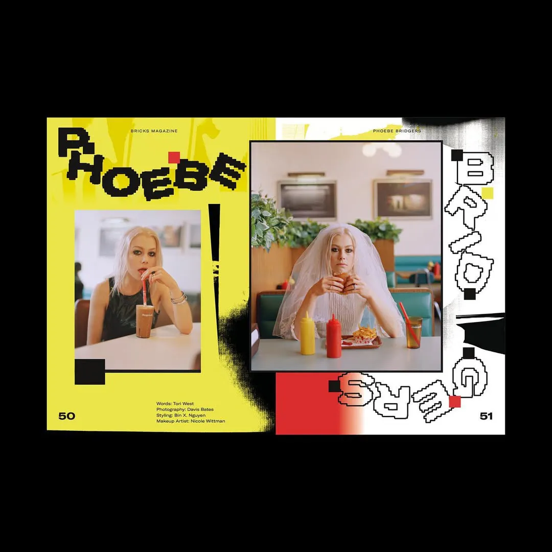
After collaborating on BRICKS Issue 15, graphic designer Yasseen Faik reflects on archives, typography, cultural work, and the realities of sustaining a career in design today.
For a generation of designers raised online, developing a recognisable, distinctive visual language can feel almost impossible. Between the constant churn of algorithmic trend cycles, our battles with comparison, and an industry increasingly shaped by speed and visibility, many creatives find themselves stuck between experimentation and employability. A lot of us, (including us at BRICKS) are trying to make work that feels personal, and that is oftentimes political and deeply personal, while of course still making rent. Yasseen Faik (Abre numa nova janela), know this all too well, “I’ve found that the better paid or more high-profile a project is, the less creative control you often have.”
Earlier this year, reports (Abre numa nova janela) warning that graphic design is a role most vulnerable to AI. But perhaps the one thing machines still cannot replicate is lived experience: personal histories, subcultures, politics, our taste, identity and our instinctive human impulse to make meaning from them.
Moving between music culture, institutional design, typography and printmaking, Faik’s work sits in a space where DIY aesthetics collide with structured systems. Raised on graffiti, rave flyers, video games and punk graphics, he has built a visual language that feels emotionally charged without losing functional clarity. “My work naturally lives somewhere in the middle, experimental and expressive, but still able to function within institutional or corporate spaces,” Faik tells us.
In this conversation, he reflects on building an archive-driven creative practice, navigating underpaid creative labour, balancing artistic identity with client expectations, and why young designers need to stop waiting for permission to take themselves seriously.
Can you tell us your route into design – were you always attracted to a creative career, or was there a point where you decided to pursue it? How did you enjoy your time studying?
I grew up around art. My gran and dad were both painters, and growing up in the 90s, I was surrounded by video games, experimental music, and creativity from an early age. My siblings and I would spend loads of time painting and making things with my dad in his basement. Really fond memories when I look back on it now. As a teenager, I got into graffiti, which was probably when I became more visually aware and started figuring out what I liked artistically and what I didn’t. Around the same time, in my late teens, I discovered graphic design and realised it was something I could genuinely pursue as a career.
Painting and traditional art felt much more inaccessible and harder to make a living from. I did a foundation course at Camberwell College of Arts, then moved to Bristol to study Graphic Design at UWE. I know a lot of people don’t necessarily enjoy university or their degree experience, but I genuinely loved mine. Bristol was cool! I made loads of friends, found my creative voice and went to lots of raves, it was mint haha! I’ve been really fortunate that my parents have always been supportive of the arts and arts education, which is rare among Arab parents. So, in that sense, I always knew I wanted to work in art, design, music, and culture. Feeling blessed that it actually happened!
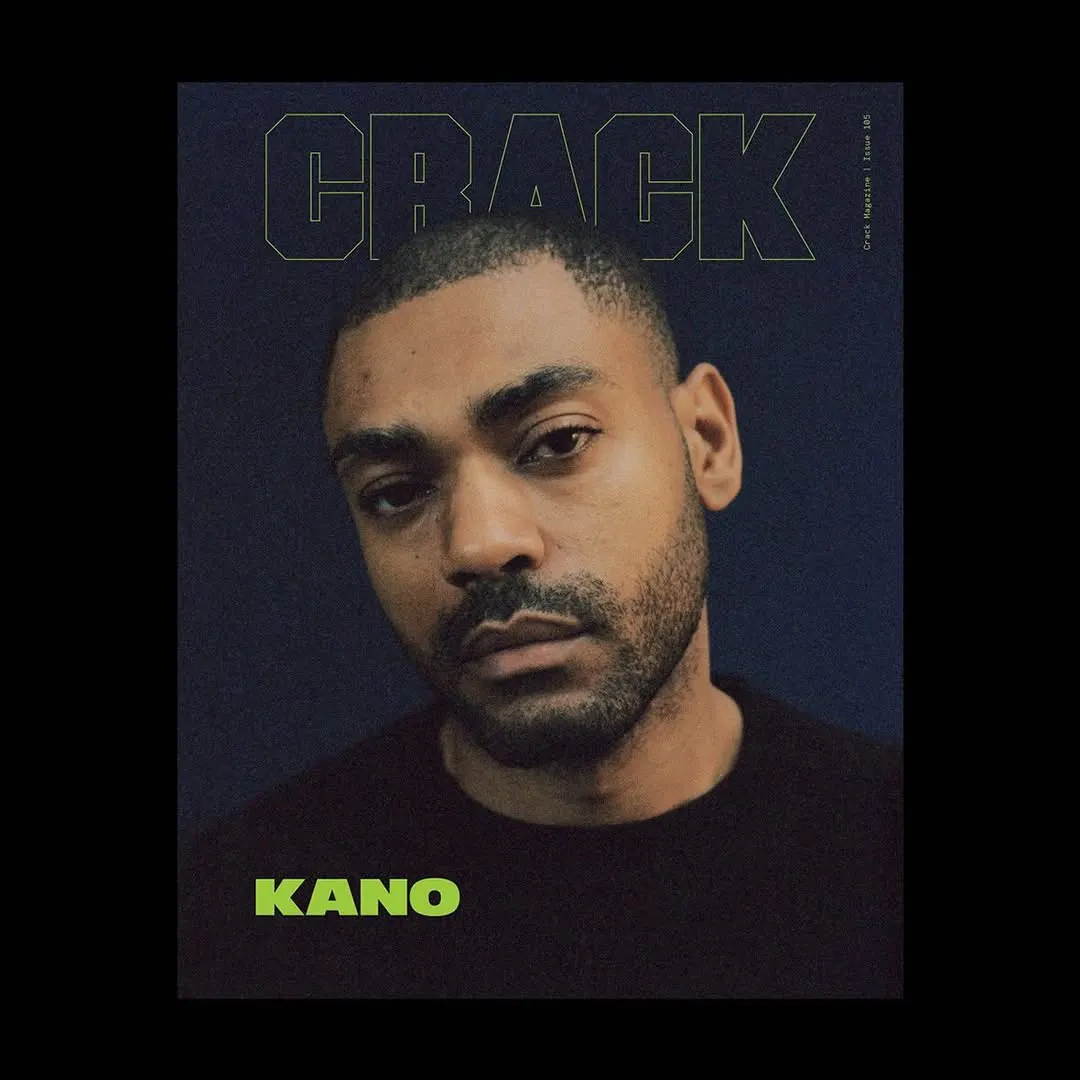
After graduating, you began working with Crack Magazine and then Tate. What drew you to these working environments, and what did you learn about your own design aesthetic through working for these institutions?
After uni, it was really difficult to find an internship or a job. It probably feels even harder now, but when I graduated in 2014, it still felt almost impossible to get a foot in the door. I was doing the usual thing, sending out dozens of emails, applying everywhere, trying to secure internships or junior roles. At that stage, I honestly wasn’t picky! I just wanted an opportunity and would’ve taken almost anything, but nothing was really coming back. I just kept persisting with it, and after about six months, I started landing a few interviews.
Eventually, I got hired by CRACK Magazine as my first design job in 2015, which felt pretty surreal at the time. After that, I worked at the Tate design studio, which was also an amazing experience but completely different from CRACK. They’re both hugely respected creative institutions in their own ways, but CRACK felt much freer, experimental, and culturally driven, whereas Tate was far more structured and focused on systems and brand guidelines. I think working between those two environments helped me understand where my own practice sits. My work naturally lives somewhere in the middle, experimental and expressive, but still able to function within institutional or corporate spaces.
Your practice sits at the intersection of graphic design, typography and printmaking. How did that crossover develop in your work, and at what point did it start to feel like a deliberate language rather than just experimentation?
The art and printmaking side of my practice definitely comes from childhood and my teenage years spent drawing, painting, and making things. The typographic focus came later through studying Graphic Design and developing a real obsession with letters, language, and image-making through type. I’ve always loved both art and design, and early on it felt important to me to find a middle ground where I could operate as a designer while still having the output and freedom of an artist. I was interested in finding a balance between creative experimentation and commercial viability. Making work that could exist within cultural or institutional spaces while still feeling personal and expressive. It was definitely a gradual process, though.
At first, it probably just looked like experimentation and trying things out, but over time, as you keep pushing certain ideas and visual approaches, it becomes more intentional. I think it only really feels like deliberate language when people start associating a particular aesthetic or visual attitude with you. That takes time. Even then, it’s still constantly evolving. I don’t think that process ever fully stops. It’s important not to become stagnant or reliant on a single aesthetic, even if it’s unique to you.
What are the references or influences you return to consistently, and how do you actually collect and organise them? Whether that’s books, archives, screenshots or something else: what does your system for building and revisiting inspiration look like in practice?
I love this question. I’m a massive archivist, both physically and digitally. I’ve built up a pretty large collection of books, magazines, records, flyers, and printed ephemera that I constantly return to when I’m working. Alongside that, I keep a huge digital archive of images and references I find online. It’s not limited to design either. It can be art, photography, fashion, science, technology, architecture, gaming, or just anything I find visually interesting or emotionally striking. Organisation is key when you have so much folders in folders. Sometimes I’ll remember a texture, image, or feeling from something I saved years ago and go digging for it again.
A lot of my process is about making unexpected connections between references that maybe don’t obviously belong together. Balancing type, image and texture. In terms of core influences, ’90s video games, dance music culture, graffiti, and punk DIY design are probably the foundations of my visual language. A lot of that work had this raw immediacy and emotional energy that still resonates with me now.
A lot of your work operates within music and cultural ecosystems that move quickly and are often under-resourced. What have you learned about sustaining a design practice in those conditions – both creatively and financially?
I’ve found that the better paid or more high-profile a project is, the less creative control you often have. So a big part of sustaining a practice is finding a balance between the jobs that pay well and the ones that are creatively fulfilling. The projects that really push your work forward or become important portfolio pieces. Music and cultural sectors in general tend to be pretty under-resourced, and there’s often an expectation for designers to work with small budgets and very tight deadlines. Over time, I’ve learned the importance of knowing your worth and not being afraid to say no to projects that don’t feel right financially or creatively. Saying no is not always an option, though; if you need the money, it can be tricky to navigate.
For freelancers, don’t hesitate to raise your day rate if you think the client can afford it ;) At the same time, those spaces also allow for a huge amount of experimentation and creative freedom, which is why so many designers are drawn to them in the first place. Some of the most exciting and culturally impactful work comes out of those environments precisely because people are pushing things visually despite the limitations. I think the key is remembering that, as designers, we’re not tied to one specific sector or industry. Diversification is important! Both creatively and financially. Having a mix of commercial, institutional, and cultural work helps create stability while still leaving room for experimentation and personal expression.
Over time, I realised that the most valuable thing you can bring to the table creatively is your own perspective.
When you’re approaching a new commission, what’s your process for balancing your own visual language with the needs of a publication or client? At what point do you push back versus adapt?
When approaching a new commission, I always try to understand the project’s intention first. It’s important to understand the context, the audience, and the tone of voice before jumping into visuals. Once there’s a clear conceptual direction or narrative in place, I can start building the visual systems around it. Typography, image-making, layout experimentation, and the overall graphic language. The challenge is always finding the balance between bringing an experimental or distinctive design approach while still respecting the client’s brand identity and communication goals.
In reality, though, that process is rarely straightforward. It’s usually very iterative, with a lot of back-and-forth. I think adaptability is one of the most important skills a designer can have. There’s no real room for ego when you’re collaborating with other people. At the same time, there must be a level of trust in the working relationship. I’ll push back if I genuinely think something isn’t going to work, but it’s also important to make clients feel involved and creatively invested in the process. A big part of the job is translating ideas in a way that makes people feel heard while still protecting the integrity of the work. Honestly, that’s probably one of the biggest day-to-day challenges of being a designer.
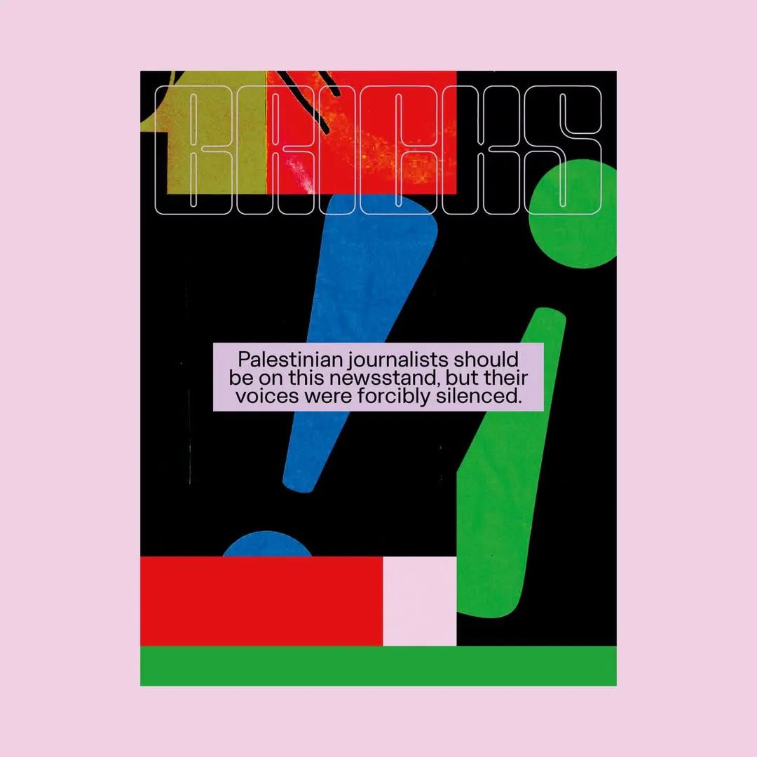
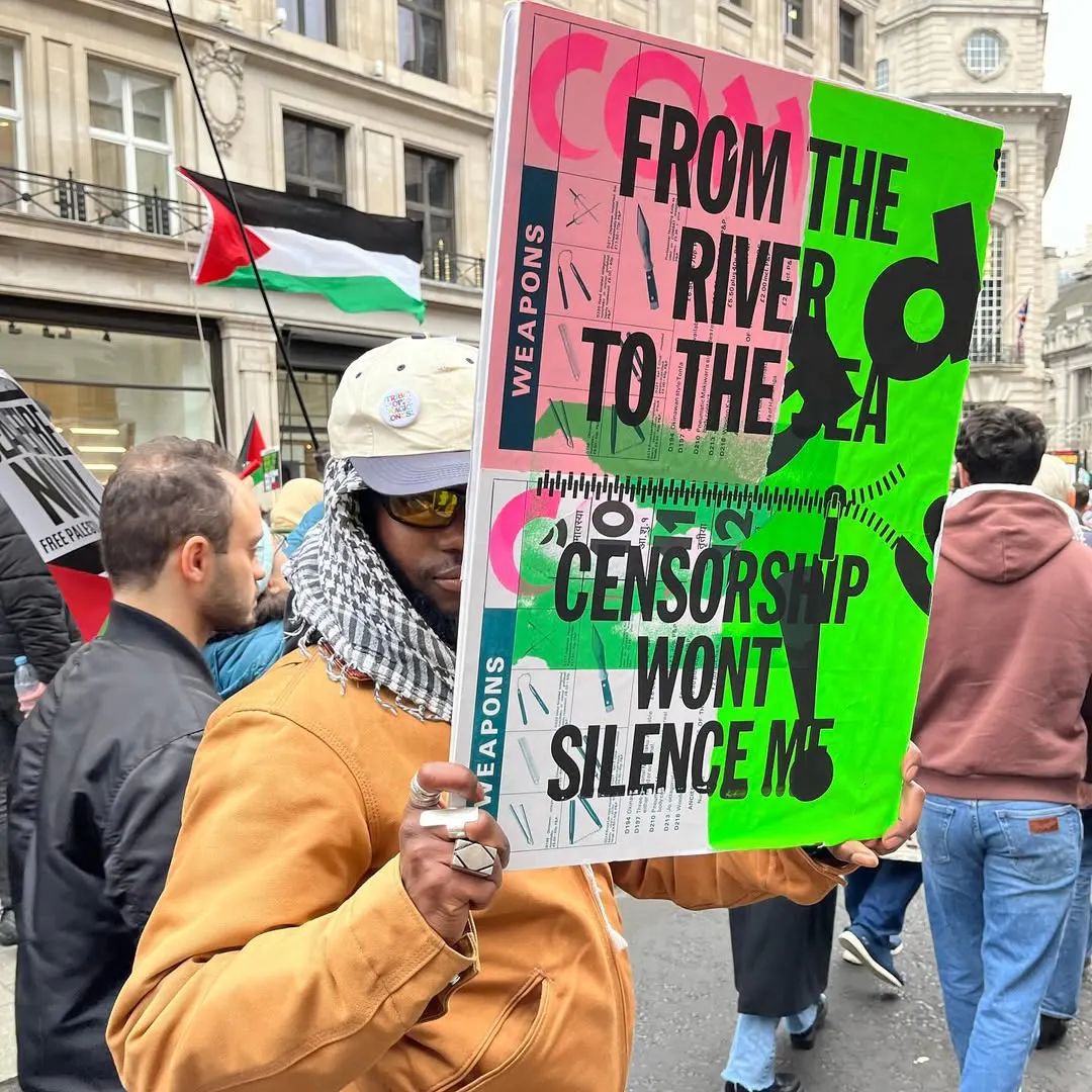
This BRICKS cover is dedicated to Palestinian journalists who have been tragically killed while reporting from Gaza. Can you talk us through your design process and the artworks that inspired it?
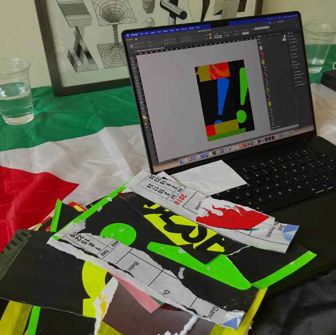
The cover design was inspired by a placard project I made with Alfie Allen in 2024. We screen-printed a series of typographic protest slogans onto collaged backgrounds, creating these bold, expressive pieces that were later handed out at a Free Palestine protest in London. There was a real sense of urgency, resistance, and collective energy in those works that I wanted to carry into the BRICKS cover. Revisiting that material felt like a natural starting point, especially given the subject matter and the importance of honouring Palestinian journalists who have lost their lives reporting from Gaza. From there, I began physically reworking the original prints. Ripping, rescanning, layering, and digitally editing them to build new compositions and textures.
The process became a combination of printmaking, collage, and graphic design, which is quite reflective of how I work generally. I wanted the final cover to feel emotionally charged and visually direct. Something that communicated resistance, solidarity, and humanity without becoming overly polished or detached from the realities it was responding to. Free Palestine forever!
What’s the most useful piece of advice you’ve received as a designer, and how has it actually shaped the way you work or make decisions?
Personally, the most useful advice I received was not to let imposter syndrome win. Being surrounded by so many talented creatives, combined with constant overstimulation online and endless comparison, it’s very easy to feel like your work isn’t good enough or that everyone else is ahead of you. I definitely struggled with that for a long time, especially earlier in my career. Over time, I realised that the most valuable thing you can bring to the table creatively is your own perspective.
You don’t have to be the most technically skilled, the most successful, or the loudest person in the room. What matters is making work that feels authentic to who you are and what you care about. That mindset has shaped my approach to design and decision-making quite a bit. I try not to chase trends or compare my path too closely to others’ anymore. True success, at least for me, is being able to stay genuine in your work and build a creative practice that actually reflects who you are.
Data
15/05/2026